Thursday, April 29, 2010

Coloring Effects

Today we will have a photo edit tutorial and sure, it is simple and easy to follow as usual. I think you may see this in many music album CD cover and some artist poster or wallpaper. Ok, let’s start then.

This is the photo that I found in Google image.

If you wish to use mine, just download here.

Step 1

Open the image in PS.

Step 2

Go to the bottom of the layers palette and click on the Hue/Saturation option. Set the setting as below:

Step 3

After that, you may get this:

Step 4

Create a new layer and set it to Soft Light Blend mode. Choose a 48px hard brush and paint the new layer as shown below. You can choose the colors you like.

Step 5

Go to Filter > Blur > Gaussian Blur > 90 pixels.

Step 6

Yup, you’re done! It’s easy and now you can edit your photo yourself easily. Thanks!

Tips:

  • The lower the saturation will decrease the color more.
  • So, the lower the saturation will increase the visibility of the painted color.

Give Your Photos a Retro Comic Book Effect

Give Your Photos a Retro Comic Book Effect


How about a fun effect for your incredibly boring photo albums? Creating a old comic book effect for your photos is easy and the results are visually appealing. More fun is achieved when adding captions to your photos using comic book fonts and design elements.

This tutorial will show you how to give a comic book look to your photos using a couple of filters and some additional decorations.

Click on the image below to see a larger and more clear image of the final results.
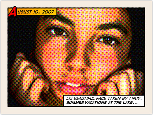
Original image by Rubén Colorado

Old halftone print effect

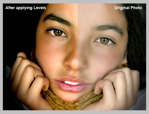
Download and open this photo in Photoshop. Now we are going to increase the overall contrast of the picture by burning it a bit. Go to IMAGE > ADJUSTMENTS > LEVELS…With this image we are going to set the INPUT LEVELS to 60 / 1.00 / 220. But this is only for this example. Choose the best settings for each photo.
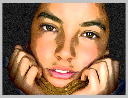
In this step we are going to give the photo an illustrated look with some graininess to give the illusion of an old and bad quality paper. It is not a realistic effect, it is just some distortion to the image to help us achieve the final look. Go to FILTERS > ARTISTIC > FILM GRAIN. In this case we are going to use: GRAIN: 4, HIGHLIGHT AREA: 0, INTENSITY: 10. Try different settings for different photos.
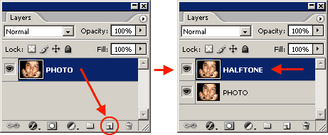
Duplicate the layer and name the new layer HALFTONE
In this step we are going apply a halftone pattern to the image to give the final old comic book printing effect. Go to FILTER > PIXELATE > COLOR HALFTONE. Set MAX RADIUS: 4 and leave the rest with the default values. Press OK and then go to the LAYERS PALETTE and set the BLENDING MODE to DARKEN.
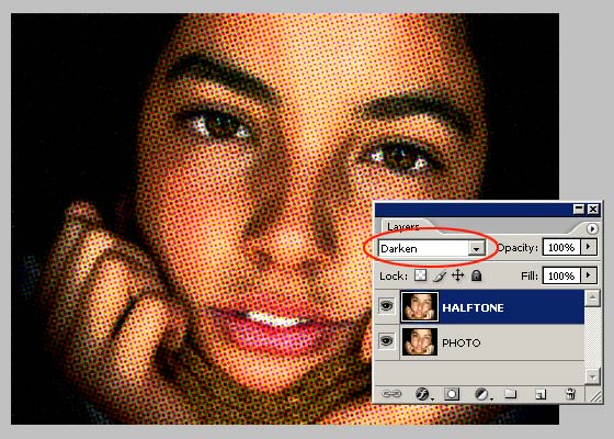
Adding comic book elements to the picture

The effect looks nice so far. It is not a realistic old comic book effect, it simple resembles that look. To make it more real, now comes the fun part. We are going to add some unique elements that are very popular on comic books and strips
Select the HALFTONE layer and set a STROKE LAYER STYLE of WIDTH: 20px, POSITION: Inside and COLOR: #F5ECE1.
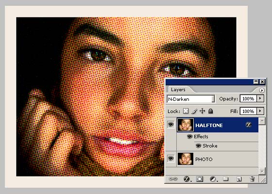
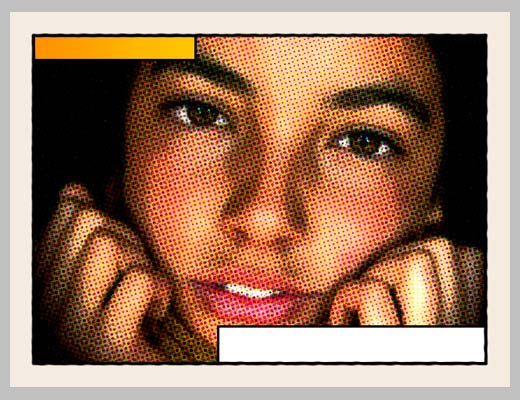
Add a new layer and draw a small rectangle at the top left of the frame of the image. Give it a STROKE of 3 pixelsand paint it orange. An orange to yellow gradient looks better. Draw another rectangle, a bit larger this time, on the lower left corner of the frame. Give it a STROKE of 3 pixels and paint it white. The final result should be like the one below:
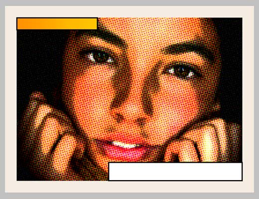
Lets add a border to the image: Add a new empty layer above the layer containing the rectangles we created in the previous step. Select the RECTANGLE SELECTION TOOL from the TOOLS PALETTE. Draw a selection from the top left (right inside the frame) to the bottom right border of the image.
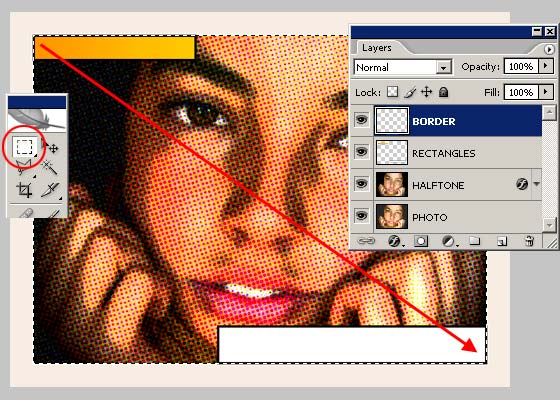
Go to EDIT > STROKE, set WIDTH: 4px, COLOR: BLACK, LOCATION CENTER and press OK.

DESELECT the current selection and go to FILTER > BLUR > BLUR MORE. Then apply a small distortion usingFILTER > DISTORT > RIPPLE… (Amount 20%, Size Medium). Now, lets sharpen the stroke a bit with FILTER > SHARPEN MORE and there you have a nice simulated hand drawn border.
Adding captions using a comic book font

To add captions to the photo you can use any font you like, but only using fonts specially designed for comic books you will be able to achieve the desired look. Download the free font Digital Strip and install it. At the end of this article you will find a lot of free and commercial comic book fonts and resources.

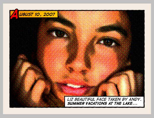
Using the Digital Strip font you’ve just downloaded, type a date on the top orange rectangle. Play with the first letter of the text by adding a stroke, a shadow and a bright contrasting color.

Then write a caption for the photo at the bottom white rectangle. Highlighting some words in bold also looks good.

And that’s all. Your image should look similar to the one below:

Click on the image to see a larger and uncompressed version.
Adding other comic book elements to your photos

If you want to learn more about comic book design, you can browse sites like Comic Book Fonts or Balloon Tales for some inspiration. Balloon Tales has published a fantastic comic book lettering tutorial that you should read if you want to make some stunning sound effects. There are lots of comic book resources, but these two are very colorful and loaded with design tips and examples.

As an example, I’ve created two images using other design elements such as balloons and sound effects:


Wednesday, April 28, 2010

Creating a Rocking Silhouette in Photoshop

If you’ve ever wanted to shine in the spotlight, try this tutorial. It shows you how to create a silhouette of a person taken from a normal photo, adding colorful light to it as if the light source is located behind this object.

Step 1

Start out by importing the image you want to cut the silhouette from into Photoshop. I used an image with a white background, which makes cutting very easy. Everyone has their own way of cutting something out, so I will not include that part in this tutorial. If you are unsure how to cut something out, look for a tutorial on that subject first.

When you are ready and feel like you have a clean cut, go into the layer’s blending options, choose Color Overlay, and set the color to black. This should give you the silhouette of what you cut out. In my example, I did the hair separately and used a lower opacity on the Color Overlay so you can still see some gray tones.

Step 2

We can add a background by creating a radial gradient (Layer > New Fill Layer > Gradient). In the gradient options, change the style to Radial and choose dark colors on the outside and light colors for the inside.

Step 3

To get some light shining, we add a Layer Mask (Layer > Add Layer Mask > Reveal All, do this while having the silhouettes layer selected). Select a large, soft brush and set the foreground color to black. While having the layer mask selected (click on it in the layers pallet), brush at the sides of the silhouette so it becomes transparent. With a hard brush I got rid of the cable that runs to the guitar.

Step 4

At this point we can add a bit more color to the light. I made a Levels adjustment layer (Layer > New Adjustment Layer > Levels). When I hit the Auto button it came up with some colors I liked. If you dislike the automatic settings, you can try hitting the Options button and changing the shadows and highlights there, or try out other types of adjustment layers.


Step 5

Cut a little piece of the original guitar and put it over the silhouette to give it some depth. For a smooth transition, use a the eraser or a mask to soften the edges. Desaturate the layer (Image > Adjustments > Desaturate) and set the blending mode to Multiply with an opacity of 60-70%.

Step 6

Copy the silhouette layer and change the Color Overlay in the Blendings Options to white. Give this layer a Gaussian Blur (Filter > Blur > Gaussian Blur) of 3-4px. Update the layers mask if needed (at some places too much white may shine through).

Step 7

If we want to insinuate some movement, we can make a few paths on a new layer. Before stroking, select a small hard brush and a darker color. Right-click the path and choose Stroke Path (while having the Pen Tool or Path Selection Tool active), in the options choose Brush and check Simulate Pressure.

Step 8

Create two more paths on a new layer, but stroke these with a large white soft brush. Add a Motion Blur (Filter > Blur > Motion Blur) to this layer.

Step 9

When adding text, we can use a piece of the background as on overlay so it fits in perfectly. Create a new layer above your text layer and use apply image (<em>Image > Apply Image) on it. Make this layer a Clipping Mask (Layer > Create Clipping Mask) and move it around to find a good part of the background. If you don’t find a good position, try Apply Image again but this time with only the background layers shown. I also added two black boxes (with a low opacity) to create a subtle letterbox effect.

Conclusion

As a finishing touch, we need some more light and color. Add a new layer and use apply image (Image > Apply Image). In the lighting effects (Filter > Render > Lighting Effects) options, add more lights to the scene (drag the light bulb icon onto the small preview). Set this layer to Soft Light with an opacity of 80-90%.

Photoshop Water Reflection - Add A Realistic Water Reflection

Written By Steve Patterson

In this Photoshop photo effects tutorial, we're going to learn how to easily add a realistic water reflection to any photo. It's a very easy effect to create and you can add it to any photo you like, although it tends to work best with images that don't already contain water in them.

We'll be using a simple filter and a displacement map to create the water ripple effect, and a Hue/Saturation adjustment layer to give our water a little color.

Here's the photo that I'll be working with throughout this tutorial:

The original photo.
The original image.

And here's what our image is going to look like after adding the water reflection :

The final result.
The final result.

Photoshop Photo Effects tutorialsNot what you're looking for? Check out our other Photo Effects tutorials!

Want an easier way to learn Photoshop? Download our tutorials as Print-Ready PDFs!

Let's get started.

Step 1: Duplicate The Background Layer

With our image newly opened inside Photoshop, we can see in the Layers palette that we currently have one layer, the Background layer, which contains our image:

Photoshop's Layers palette showing the original image on the Background layer.
The original image on the Background layer in the Layers palette.

We need to duplicate the Background layer, and we can do that using the keyboard shortcut Ctrl+J (Win) / Command+J (Mac). Now when I look in my Layers palette now, I can see that I now have two layers - my original Background layer on the bottom and a new layer, "Layer 1", above it which is my duplicate:

The Layers palette now showing the duplicate Background layer above the original.
Press "Ctrl+J" (Win) / "Command+J" (Mac) to duplicate the Background layer.

Step 2: Add More Canvas Space To The Bottom Of The Document

We're going to add our water reflection below the image, so let's add some canvas space to the bottom of our document to make room for our reflection. To do that, go up to the Image menu at the top of the screen and choose Canvas Size. This will bring up Photoshop's "Canvas Size" dialog box. The easiest thing to do here is to add twice as much canvas space as what we currently have, but we only want it to appear at the bottom of the document, not above it or on either side, so we need to tell Photoshop exactly where we want this extra canvas space to go.